Elevating the Program Page Experience
To improve the experience for prospective students, National University redesigned its program detail pages by applying core UX principles. The original template lacked sufficient detail and forced users to rely on static PDFs for key information. By introducing an accordion-based layout, the redesign made content more accessible and user-friendly without overwhelming the page. User research and iterative wireframing informed the solution, resulting in a cleaner, more intuitive interface. Early tests showed a notable increase in engagement and RFI submissions, validating the impact of a UX-driven approach.
Portfolio type
Project
Project timeline
Mar 2018 - May 2018
Sector
Higher Education
Role
E2E lead on Product design, User research
Platform
Responsive Marketing Website
Empathize
National University offers 100 plus online programs. Potential students would visit a desired program detail page in order to find out more information. To maintain consistency, a program detail page template is used for each of the programs offered. The page template was not super long-- it did not allow for enough details about the programs and it functioned as just high-level marketing speak, with no real useful information. If a potential student did want to find out more about the program, they had to click into a static PDF that opened up a new tab, and would then have to look through to find more information regarding outcomes, classes needed, etc.
Define
Problem statement
I am...
a prospective student exploring online degree programs
I am trying to…
find information about a specific program to decide if it's the right fit for me
But…
the program page vague marketing language and links off to PDFs with old content
Because…
I need a convenient way to understand course requirements, outcomes, and faculty info without extra clicks
Which makes me feel...
frustrated, uncertain, and less motivated to move forward with a request for information.
Requirements
To enhance the new page on National University program pages, several primary elements are required. These include an RFI (Request for Information) section, a Quick Facts area, a comprehensive Program Overview, and new sections for Unique Program Learning Outcomes, Course Listings, Program Requirements, and Faculty Info. The Faculty Info section should feature names and titles that hyperlink to individual faculty bios. Additionally, a larger and more prominent PDF button will be added to ensure easy access to related downloads and useful links. These components will collectively provide a more informative and user-friendly experience for visitors.
Hypothesis
Balancing all the required elements on the page while keeping it relatively small was a significant challenge. To address this, we decided to use an accordion, a popular UI pattern. Accordions are an excellent solution as they inform users that additional information is available with just a click. We believed that by providing more detailed information through this interactive format, students would be more likely to submit the Request for Information (RFI).

The 3 primary areas of focus for our program detail page
Ideate
Once we organized our research and defined our solution, we began exploring potential designs for the page. We started with sketches to translate our ideas into tangible concepts and better visualize the problem. This initial step allowed us to quickly explore various layout concepts, as illustrated by the quick wireframe below.
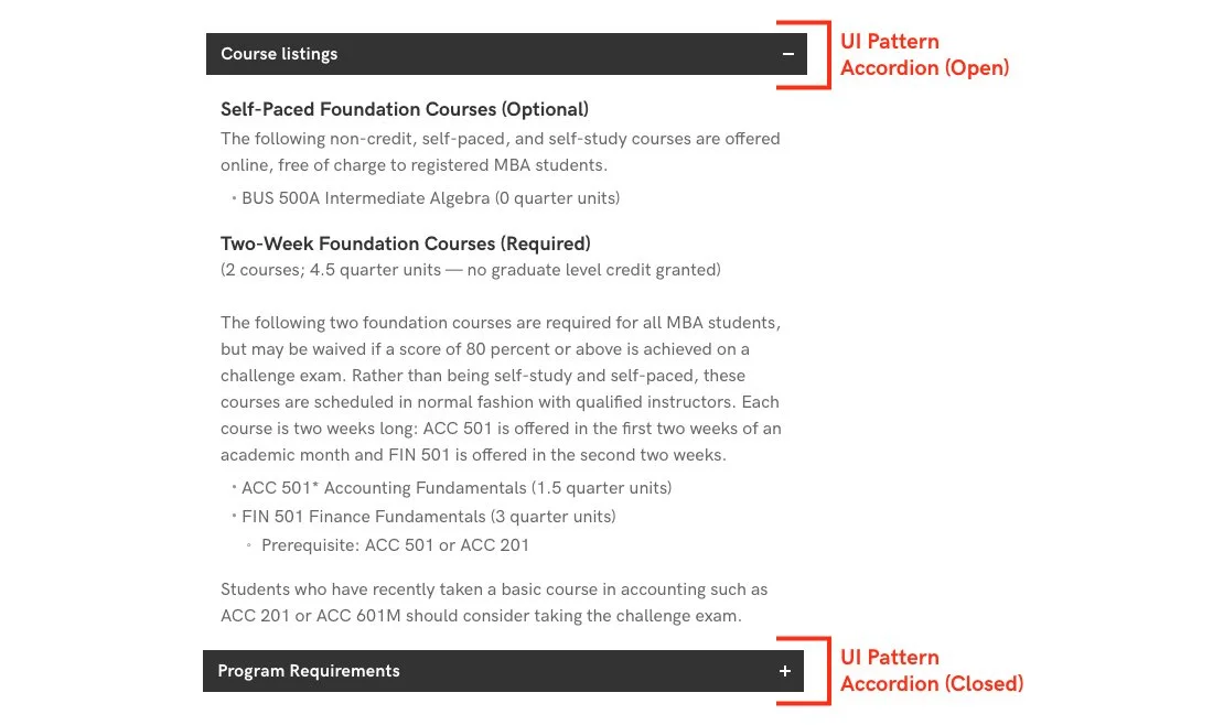
Example of using an accordion to hide content
After defining the core functionalities essential to our solution, we created low-fidelity wireframes. These wireframes helped us decide what elements to include in the final user experience before moving on to the next iteration of our design.

Wireframe concept of what the new National University website should look
Test
We designed a total of three pages for our test. One page served as the control, while the other two were new pages incorporating the agreed-upon accordion UI pattern. The test was conducted on our top-visited program pages, which receive the most organic traffic, including the MBA, BS in Biology, Bachelor of Science in Nursing – RN Completion, and Master of Science in Nursing programs. This approach allowed us to compare the effectiveness of the accordion pattern in both expanded and collapsed states against the existing design.

A desktop mockup of the 3 options for program pages
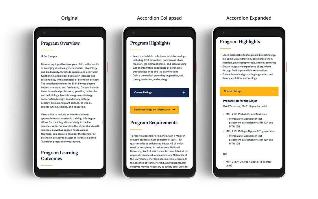
A mobile mockup of the 3 options for program pages
Results
The test was completed when we observed significant increases in user engagement for both the Accordion Collapsed (+18.71% against the original) and Expanded (+11.35% against the original) versions. The test didn’t need to continue past its statistical significance, because we had confidence in the data to make the right decision. To ensure the reliability of these results, we then opened up the test on all program pages.

A dashboard view of the 3 options for the program pages