Simplifying the Path to Enrollment
The National University application overhaul simplified a complex 14-step intake form into a streamlined, three-step experience called App-Lite, grounded in UX best practices like mobile-first design, user flow optimization, and motivational cues. By reducing friction and highlighting next steps, the updated system eased user anxiety and increased lead conversion. These changes resulted in a 21.5% year-over-year increase in leads.
Portfolio type
Project
Project timeline
Mar 2018 - May 2018
Sector
Higher Education
Role
E2E lead on Product design, User research
Platform
Responsive Marketing Website
Empathize
The enrollment department at National University was inundated by the number of leads/ students filling out intake forms. The department wanted to be able to work with potential students in a timely manner. The goals were to help the department field leads by expediting the “new student” process and helping advisors manage the incoming lead flow. To do this, we created a double-layered thank you page set up.
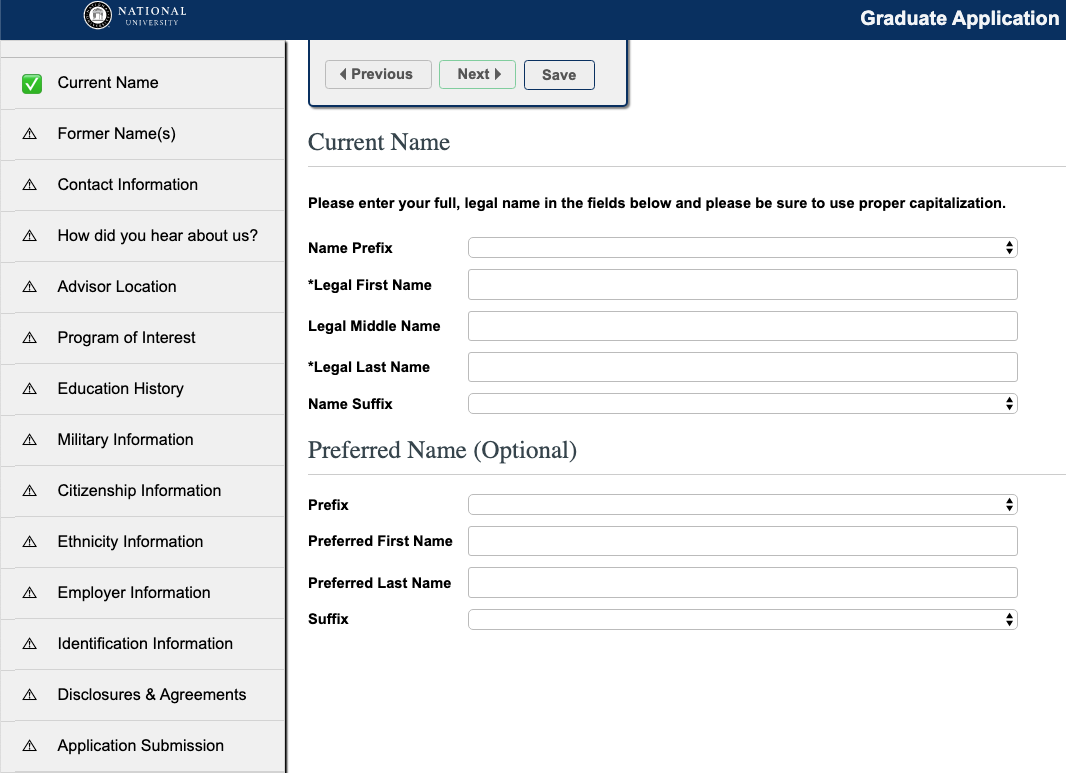
Old application showing all 14 steps a user had to go through to submit
This is one of the last steps in the funnel to becoming an admitted student, but also one of the most important. This is where we take prospective students' inquiries and turn them into leads so it is crucial that the process and the application itself have a good user experience. Going back to school can be overwhelming and intimidating and the application was too much to go through. There were 14 steps a user had to take - way too many. It's understandable why there was a high abandon rate and low completion rate. Users got scared, overwhelmed, and just left.
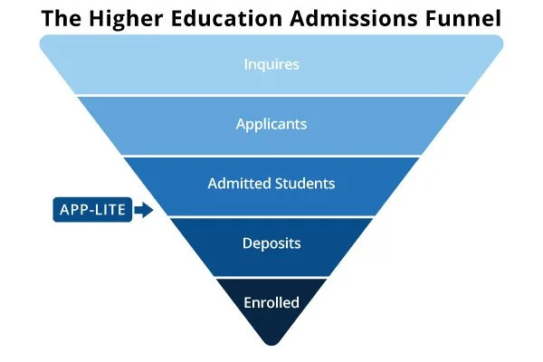
Location of the App-lite offering in reference to the admissions funnel
Problem statement
I am...
a prospective student interested in going back to school
I am trying to…
complete the online application to start the enrollment process
But…
the application is long, overwhelming, and confusing, making it hard to finish
Because…
there are too many steps and no clear sense of progress or support
Which makes me feel...
frustrated, anxious, and unsure if I want to continue.
New user flow
The big idea here was to have the user only fill out a couple more form fields to hook them. Then, because an advisor knew they were interested they would reach out to them to put the finishing touches on the application.

User flow for app-lite form and submission page
Solution
The first thank you page contained a “jump to application" button for the potential student to click. Here they would fill out a few more form fields and by doing so, they would be moved to the “front of the line.” The purpose of this was to motivate leads to act quickly and, in turn, this enabled advisors to determine and prioritize warmer leads.
To achieve this, we converted the original, long, cumbersome form into a multi-step form. Research shows that multi-step forms have a 14% higher completion rate than single-step forms. In this consolidated application, we called App-Lite, there are only 3 steps that actually hit most of the information in the 14 steps. All throughout this experience the user is reminded that they would be fast-tracked for communication with an advisor. Also, there was a personal video on the Thank You page from the President of National University once a user applied.
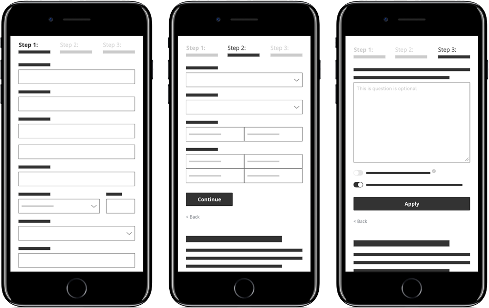
Low fidelity wireframes showing elements and user journey
Implementation
We always implement a mobile-first design strategy since most of our traffic comes through mobile. The idea here is to start sketching and prototyping for the smallest screen first and then work up to larger screens. Essentially, it's about delivering the right user experience for the right device.
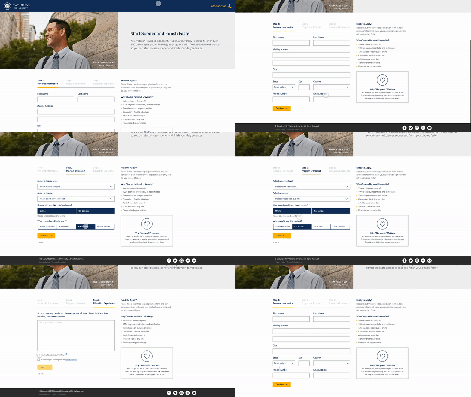
High fidelity mockup of 3 step app-lite process
Results
Performance for this strategy has been really well received from both prospective students as well as the advisors in Enrollment. Implementing these changes helped secure more overall leads and thus more revenue for the University. Overall leads have gone up 21.5% year-over-year because of the implementation of this strategy/page.
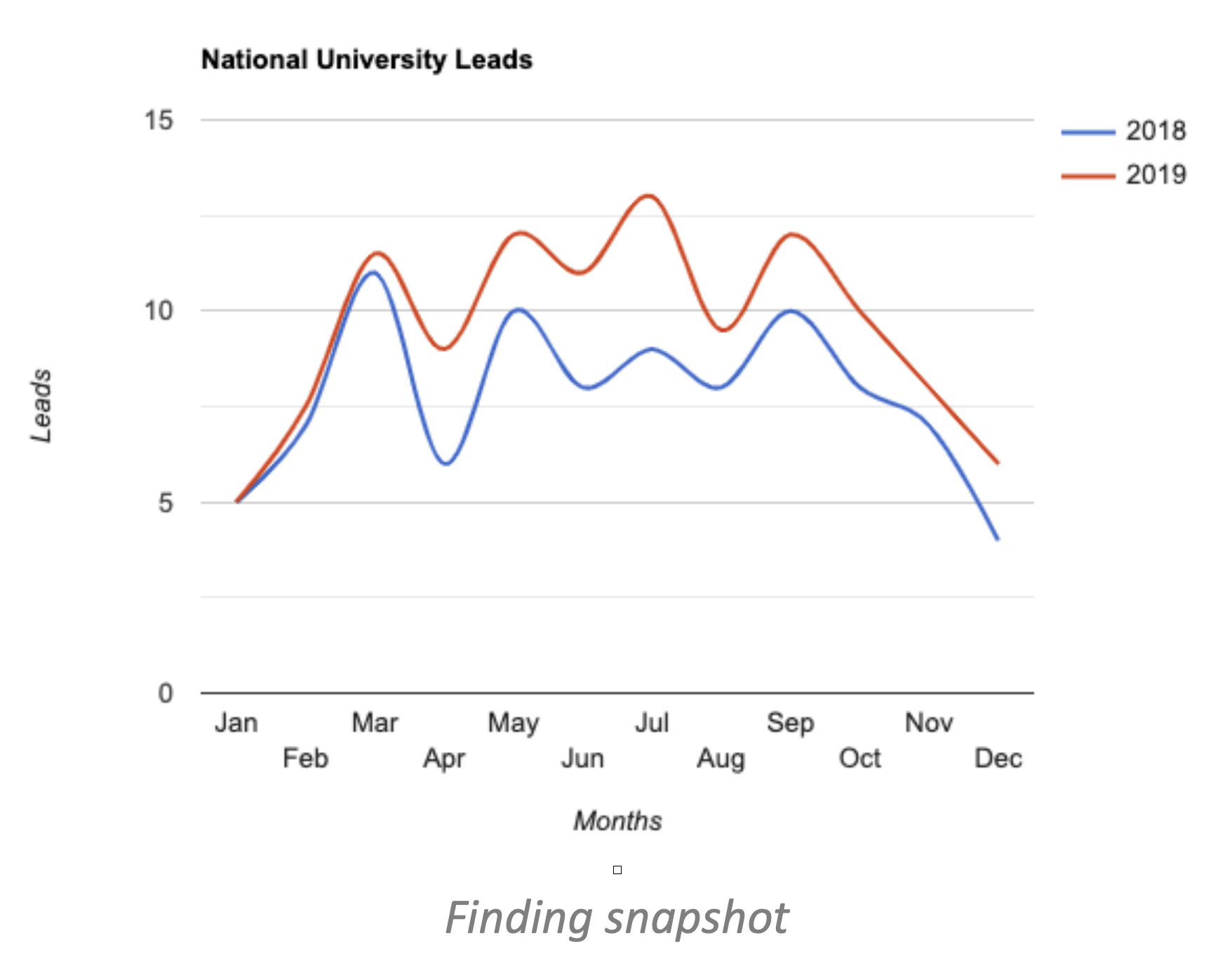
Year-over-year comparison of leads from 2018 to 2019