Making Tuition Transparent and Simple
The National University Tuition Calculator tackled a key user need—clear tuition information. Research showed cost was a top concern, but the old site buried or confused this info. The redesign added a tuition calculator directly on program pages, making it easy to estimate costs. Despite development delays, the update led to major engagement gains, up to 97%, proving that better UX drives user confidence and conversion.
Portfolio type
Project
Project timeline
Jul 2020 - Oct 2020
Sector
Higher Education
Role
E2E lead on Product design, User research
Platform
Responsive Marketing Website
Empathize
Each year, we collaborate with an external agency to conduct comprehensive research on prospective students. This 200+ page document delves deeply into the factors that influence a prospective student's decision to return to school. It serves as an invaluable resource, providing detailed persona information, insights into competitive tuition costs, and data on growing industries to help us tailor our marketing efforts.
Through this research and our own evaluations and analytics, we identified three crucial questions that prospective students ask themselves:
Do you offer my program?
How much does it cost?
Where is the program held?
In this project, we are focusing on the second question, "How much does it cost?" The cost of returning to school can vary significantly due to the complexity of tuition. According to our research, most of our target demographic are adult learners who are returning to school after a break. These breaks are often the result of major life events such as career changes, marriage, or having children. Consequently, many of these students will have transferable credits from previous educational experiences.
Define
Problem statement
I am...
a prospective student exploring degree options at National University
I am trying to…
understand how much it will cost to go back to school
But…
the tuition information is hard to find and confusing
Because…
the site buries key details and doesn’t provide a clear way to estimate my costs
Which makes me feel...
frustrated, uncertain, and less confident about enrolling.
Key Issue
On the old page, finding any information on tuition was a struggle. While the university was operating from the thought process, “How can you put a price tag on your future?” The lack of information wasn’t serving prospective students.
Example of the old Program Page without any information on Tuition
We used analytics to see that ‘Tuition’ was a term frequently searched for on the site. Users wanted this information, but they were not able to find it easily, so they ended up searching for it. And once you did find it, it was still pretty confusing with several tables and graphs that users had to decipher in order to try and figure out how much it was really going to cost.
Ideate
The Solution
In the new design of the program page, we put tuition right in the users’ faces. One key UI pattern utilized here was tabs to help shorten the page. Other goals were to provide more space for long content and improve the design on mobile devices. Now there is a whole tab dedicated to tuition. On the tab itself, the key feature would be the tuition calculator. With some fairly simple math, users could now figure out what the cost of going back to school would cost them.
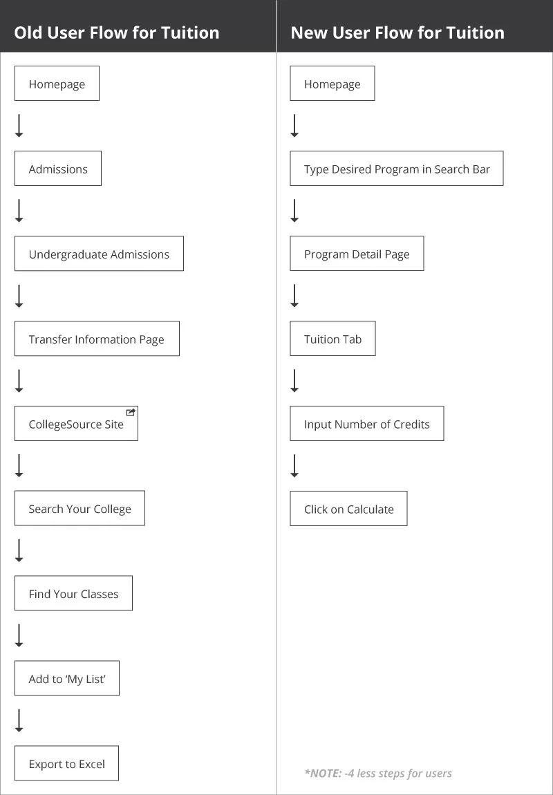
Old vs new user flow for tuition
As shown in the user flow above, having a user go to another site (CollegeSource) and search their college, find their classes, and export them to an excel spread sheet was too involved. Even worse, the excel spread sheet didn’t actually provide a cost. With the new user flow, we reduced the number of steps, simplifying the experience to using a calculator to find out your estimated tuition.
Hypothesis
The belief was that if prospective students were given shorter, more digestible content with better tools, like the tuition calculator, it would generate more leads and thus they would be more likely to enroll in the university resulting in higher revenue.
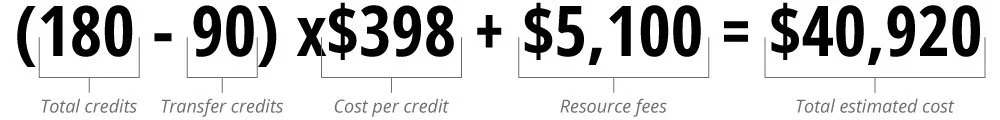
The math equation to figure out the cost of tuition for prospective students
Even though it looks like simple math, on the back end, it can have a lot of functionality. Knowing a bit of code myself, I know any time you are dealing with math, and inputting of numbers, it can get to be quite involved.
Implementation
Getting buy in from the client was fairly straight forward and they were excited that this new feature would be available for prospective students to use. Where it was a struggle was within our own team. Although this feature was discovered in the ideation phase, it was not part of the original scope, and because of this dev was caught off guard. The dev team, who would actually have to build this, was worried about budget, timeline, and extending the launch date in order to have this feature be included with the rest of the updates to the page. After much debate from all teams, it was decided the launch date would not be pushed out, and the tuition calculator would be pushed to a phase II, after the pages went live.

Low-fi mobile wireframe of tuition calculator
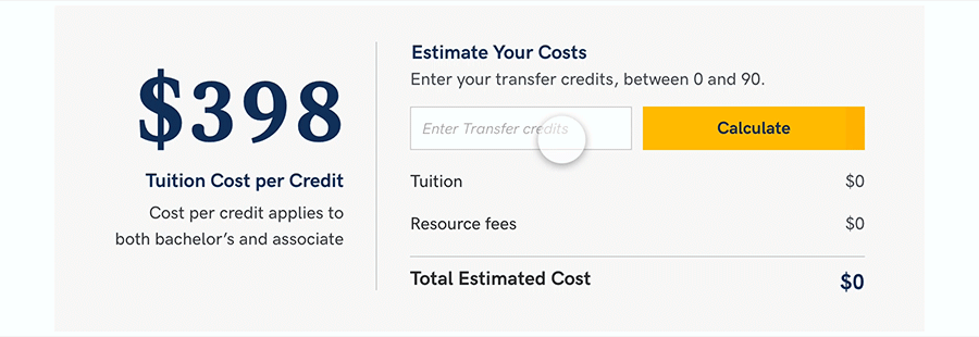
High-fidelity desktop prototype of the tuition calculator
Results
The top 5 programs at NU had the following increases after 85 days:
MBA Program Page: 52% improvement over original
BS Computer Science Program Page: 51.5% improvement over original
BBA Program Page: 97% improvement over original
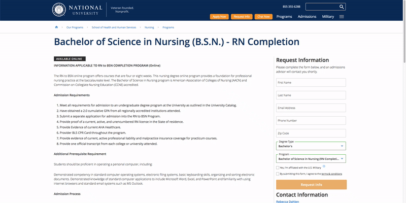
RN to BSN Program Page: 47% improvement over original
BS Nursing Program Page: 32% improvement over original

Overall improvement to program pages vs the control/original