CityU Website Redesign
Goal
Redesign City University of Seattle’s website to better serve two core audiences: working professionals and international students. The previous site was outdated, difficult to navigate, and failed to communicate the brand’s value or support the user's decision-making process.
My Impact
I led the end-to-end redesign, applying user-centered design methods including research, content audits, card sorting, usability testing, and high-fidelity prototyping. I collaborated across teams to define architecture, wireframes, and visual direction while ensuring accessibility and responsiveness.
Outcomes
The redesigned site led to a 212.5% increase in RFI submissions within one week of launch, and 171.2% after one month. Usability improved significantly for both domestic and international users, and the new structure boosted engagement across program-related pages.
Portfolio type
Case study
Project timeline
Jan 2019 - Jul 2019
Sector
Higher Education
Role
E2E lead on Product design, Service design, Design system, User research
Platform
Responsive Marketing Website
Empathize
What is CityU?
Since 1973, City University of Seattle has been relentlessly reimagining higher education in the Pacific Northwest and around the world. As an accredited, private, nonprofit university, our mission is to provide career-relevant education to busy professionals who want to advance their careers and compete in the global marketplace.
I am going to take you on a journey on how I redesign CitU’s website. I have documented the process, my thoughts, methods, wireframes, prototypes, and finally the live site. The design process that I followed goes through five stages of user centered design: Empathize, Define, Ideate, Prototype, and Test.
Who is the Audience for CityU?
Working Professional
CityU serves the working professional, an individual who is pursuing a promotion or career change while juggling family and/or a full-time job that makes pursuing a degree for them feel particularly difficult.
The average CityU student is between 37-45, with 62% of their audience being female.
These are working professionals that are potentially dealing with a desire for “career shifting”; they want to pivot to a different industry for various reasons.
There are also people who are wanting to go further into their career—who need to go back because they want to grow in their industry.
These prospective students want more in their lives — they’re seeing a lot of change around them, and they’re staying the same. They want to be part of the evolution.
The CItyU prospective student is someone who understands that it might be “hard”, but they refuse to be a part of the pack. They’re hard workers – and want to contribute to the world in their own unique way. CityU serves as the catalyst for this.
International Student
The international student is a traditional college student in their beginning years of education, typically between 18-24.
These students are go-getters – they are willing to do whatever it takes: study the long hours, stack courses and/or work late nights if that’s what it takes.
These are individuals with entrepreneurial spirits and goals – and they’re often one of the first to get a college degree in their family or leave the country.
These students are driven by their home country pride, providing opportunity for their family or futures.
They want to know how the university is going to support their education, but their careers.
Passion-driven, and determined to succeed, these are individuals that need to feel as though they are surrounded by faculty who care about their future, like more than a number.
Why does CityU’s website need a redesign?
After a careful analysis of the CityU website, drafted from our analytics team, we drew the following conclusion of why it needed a redesign:
Streamlining their messaging towards the working adult and transfer student. Currently, “all about the finish” leaves students feeling like the only thing CityU cares about is finishing their degree.
Simplifying the UX experience – currently, unless you know what you were looking for, it is a struggle to find what you’re looking for.
Revisit the content to be more concise and a more distinctive brand voice for CityU.
Evolving design to be more modern, image-forward and Seattle-focused – all colors, fonts and imagery up for change.
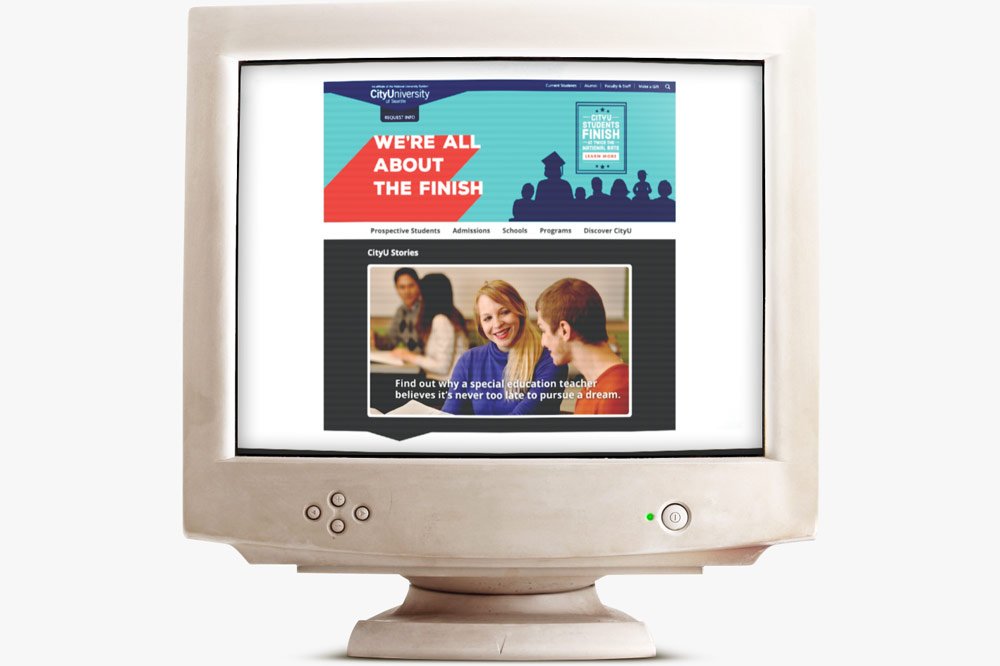
Former CityU website: Mid-90s design with silhouette and solid shadow
Define
Problem statement
I am...
a prospective student exploring options to advance career
I am trying to…
find clear, relevant information about programs, admissions, and student support on the CityU website
But…
the site is outdated, difficult to navigate, and lacks clear direction
Because…
the content is disorganized, the flow is confusing, and the design doesn't reflect the needs of adult learners
Which makes me feel...
frustrated, uncertain, and less confident in choosing CityU as the right fit for my goals.
Identifying Problems in the Current Website
No clear CTA
Navigation menu is split and upside-down
The website looks outdated with silhouettes (very 90s)
The real brand value is not visible
Not able to find program pages easily
Color contrast violations everywhere. Not WCAG complaint
Flow hard to follow, no real presents of hierarchy
Pages hidden under not related parent and child pages (site architecture problem)
Old, outdated, and duplicative page/content (very bad for SEO)
Problems in the current use cases
At first glance, the user is not able to:
Understand what CityU is
Find a related program in their field of study
Find information on student services
What happens after they RFI or fill out CTA
Measurement of the new redesigned website
Increase traffic volume and page sessions to the Program Finder.
Increase engagement with RFI.
Allow for ease of use for both US Domestic and International audiences.
Key Benefits
CityU offers numerous benefits to their audience, with these as their focus:
CityU has a 55.1% Completion Rate compared to the national average of 22.5%.
One-on-one staff support – they’ll have someone not only rooting for them but helping them every step of the way.
CityU focuses on helping current and prospective students through the “start” and “stop” process they go through when trying to work to finish their degree; CityU understands finishing is hard, they want to help through every obstacle.
CityU offers a range of 60+ programs both offline and online – a mixed media version of college that will allow them to finish on THEIR timeline; CityU is built for the working adult.
CityU has a strong international presence and relationship with their international partners – with many locations throughout the world (Canada, Slovakia, Mexico, Czech Republic, Switzerland, China, etc.).
CityU’s faculty are professionals in their industry, they can share hands-on, in-the-field experience with students.
Content audit
As part of the CityU website redesign, we began with a comprehensive content audit to assess the volume, structure, and relevance of existing pages. This foundational step clarified what content needed to be removed, consolidated, or created—offering a clear view of the site's ecosystem and informing strategic redesign decisions.
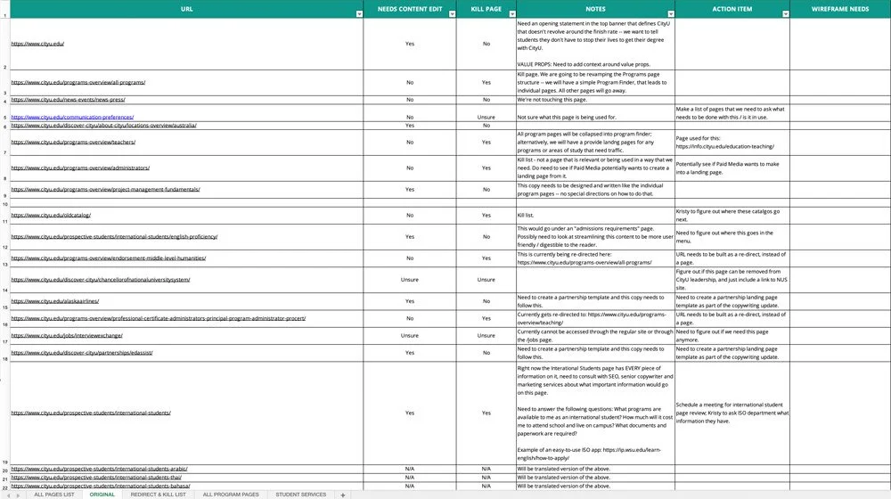
List of all web pages and audit for CityU: Necessity and rationale
Information architecture through card sorting
We conducted card sorting exercises to guide the development of a new Information Architecture (IA). By mapping out the original sitemap and engaging stakeholders in collaborative discussions, we uncovered valuable qualitative insights and validated our IA decisions with user data.
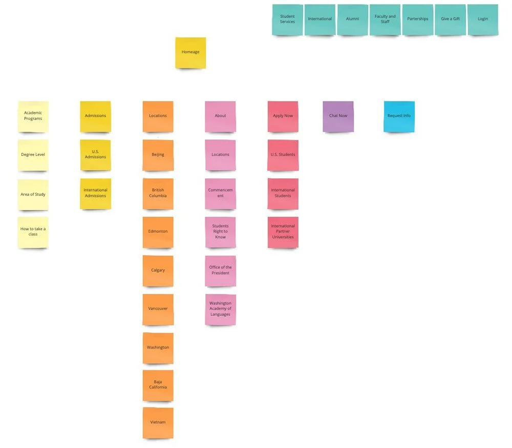
Card sorting example of what the CityU website should look like
Data-driven decision making
To complement qualitative insights, we analyzed site analytics to identify and prioritize high-traffic pages. This ensured that user-relevant content was preserved and elevated in the redesigned site structure.
User flow testing
We created and tested user flows through task-based exercises. A critical task asked users to locate the MBA program as if they were prospective students. Testing exposed pain points in the original IA, which forced users to navigate through complex school and department layers that did not match user expectations.

Old information architecture: Difficult navigation and extra pages
UX Solution: Area of study navigation
To resolve these usability issues, we reorganized the navigation using areas of study, a structure that aligns more naturally with how users search for programs. This change significantly improved task success rates and made the experience feel intuitive and user-centered.

Adding a program finder: Improved navigation and faster user access
Ideate
Quick competitive analysis
Common Patterns Observed:
Clear CTA (call to action)
Better engagement with RFI (request for information)
Better flow and understanding of hierarchy
Quick facts or Program pages to help user know more about the program quickly
Tuition Calculator
Solutions – the must haves
These are key objectives to have on the website that would solve most problems analyzed from the current website:
Improve and simplify the User Experience, making the navigation of key pages a seamless experience across all user types.
Streamline experience for each inquiry type, including but not limited to application type, prospective student, current student, and general population base.
Increase brand visibility in the local market presence and offerings that help CityU stand out from the crowd.
Increase the amount of website engagement, lead generation and applications.
Information Architecture
We ran through making an Information Architecture (sitemap) board of the CityU website. We did this by crawling the old site, making a sitemap out of it, then auditing that along with going through a card sorting method/process.
Prototype
The team would have a kick-off meeting to discuss and define the desired templates needed for development to build out the entire site. We came up with a total of fourteen:
Homepage
Menu
Search
Program Finder
Program Detail
U.S. Admissions
International Admissions
Student Services
Locations
Partnership
Blog
Blog Post (Single)
Catch-All w/ Side Rail
Catch-All w/o Side Rail
I started by making sketches on a pad of paper in the meetings. Once I understood the flow and what was needed on the page, I took what was written down and put them into a low fidelity wireframe.

Mobile wireframes: Top CityU page templates
High-fi mockups
Once the wireframes were signed off by all stakeholders, including development, more of the visual aspects could be brought in. This was mostly done through a brand style guide which was part of a bigger project to launch a new brand campaign for CityU.
Test
Since we knew the current site was underperforming, it was immediately clear the redesign would offer significant improvements. However, testing remained a crucial step. We conducted usability tests using task-based scenarios to validate our new user flows, ensuring users could easily find programs, submit RFIs, and understand CityU’s value proposition. Internal stakeholders and real users provided feedback on high-fidelity prototypes, which informed final refinements before launch.
Implementation
With validated designs in place, we partnered closely with development to bring the new site to life. We focused on responsive design, accessibility compliance (WCAG 2.1 standards), and performance optimization. We provided detailed design specs, annotated wireframes, and collaborated in agile sprints to ensure alignment.
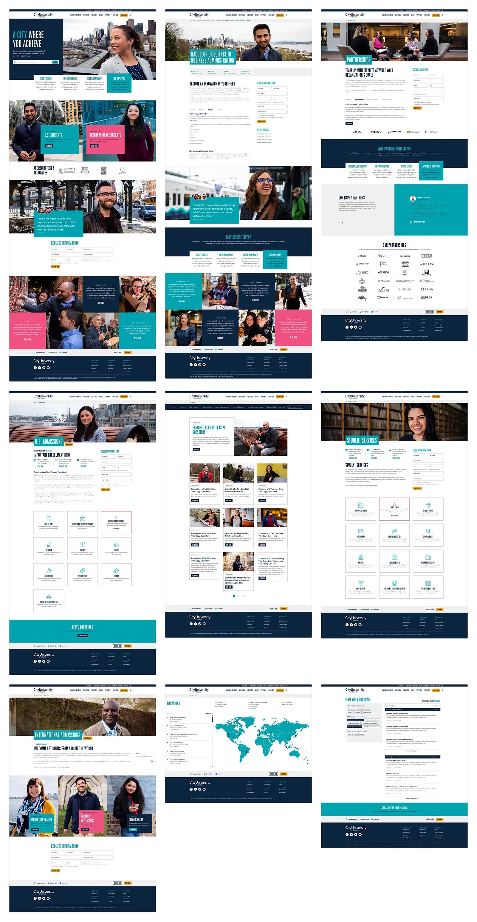
Desktop hi-fi mocks: Top CityU page templates

Mobile hi-fi mocks: Top CityU page templates
Results
The new site launched in July 2019 and showed immediate impact. Our primary KPI—Request for Information (RFI) submissions—increased by 212.5% in the first week. Even after a full month, the gain remained strong at 171.2%. Navigation clarity, visual appeal, and content relevance contributed to improved engagement across key pages, validating our research-driven approach.

Metrics of a 171.2% increase in RFI submissions
Future
The launch was just the beginning. We adopted a continuous improvement mindset, using A/B testing and behavioral analytics to refine content, CTAs, and page layouts. Post-launch data continues to inform optimizations that drive user engagement and support enrollment goals.